
PG&E Accessibility Redesign
Summary
Pacific Gas & Electric (PG&E) provides natural gas and electricity to most of the northern two-thirds of California, serving approximately 16 million people and 5.2 million households.
Many of the households, especially lower income households, access the experience via their mobile phones, but only certain sections of the experience were designed with mobile in mind.
After the company was involved in a lawsuit over the accessibility of their online experience, they additionally needed help bringing their experience in compliance with federal accessibility guidelines.
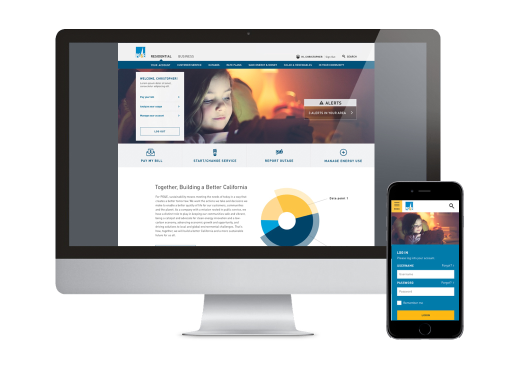
Their site has multiple identities, the most prominent two for residential and small business customers. They also maintain a safety portal, corporate information, newsroom, and a collection of additional microsites—all linked together, but with different navigations and visual identities.
The sites contained thousands of pages of content, much of which was hardly, if ever, even accessed or read by visitors.
The Ask
Create a template and component system for their unauthenticated functions and content housed in SiteCore content management system. Our team's copywriters would use this system to rewrite and edit content and then hand off to PG&E to maintain and expand in the future.
Unify the navigation, layout, and visual system to create a single identity and enable seamless navigation between different sites and microsites.
Bring the site into accessibility compliance to WCAG AA standard.
Make the system work for mobile.
Un-bury the content and make it easier to digest and navigate, roughly reducing the content to 1/3 its original volume.
My role
Led a team of 2-5 user experience designers (depending on the project phase) working on the core residential experience.
Contributed to wireframes and annotations for a responsive component and template design system that enforced consistency and a unified identity, met accessibility compliance, and encouraged future content writers to create easier to scan "chunks" of content. This system was used by the parallel projects for the Business portal and Energy Efficiency initiatives and by our content team as they re-wrote and reduced the content.
Trained our creative team on design for accessibility and introduced a self-auditing system.
Created a site map built in coordination with the content strategy team to organize the reduced content.
Gathered feedback and requirements from client stakeholders, and coordinated work with parallel portal tracks for the small business and energy efficiency tracks, as well as visual design, development, and content tracks of work.
Participated in the discovery & define phase of the small business portal.
User Journeys (Small Business Portal)
In our discovery phase, we dug into all the market research and analytics shared by PG&E and built customer stories and journeys to help us understand our users’ experience.
Wireframes and annotations
I workshopped extensively with our development lead and content lead to understand the capabilities of the content management system and the needs of writers to build the right set of components that could accommodate the content necessary for the hundreds of pages across the site. Components as we designed them were reviewed weekly by PG&E client stakeholders who gave feedback to help us iterate and refine our components and templates.
Once our team of over a dozen copywriters started tackling and rewriting content, I worked with my UX design team and content and copy leads to help develop templates.
edits on a template printed
I led a team of 2-3 other UX designers (depending on the work phase) to create and iterate on our wireframes for content components and templates. The designers reviewed their work at least twice weekly with our development team (much of which was in India), copywriting team, and visual design teams to make sure we were moving in the right direction.
Site map
Our site map needed to contain a visual vocabulary to account for several important factors affecting pages and how they connected and related to each other. We weren't designing the authenticated side of the experience, but still needed to document where we linked to the authenticated pages, it was important to our developers to know which pages had forms and interactive elements, and we wanted to be careful to indicate where links repeated elsewhere in the experience.
Visual Design
Once each batch of wireframes was complete, I worked closely with the visual design team to make sure learnings from our dev team, content team, and client review were preserved. We additionally spent a great deal of attention to considering whether the components were designed with accessibility and mobile approaches in mind.
Afterword
We passed our accessibility compliance audit and our mobile design won several industry awards in 2016 for its content design.
Like most of my agency projects, I was on to other projects as soon as design was complete and I didn’t get the opportunity to follow up on any behavior results. It would have been nice to review CSAT scores or similar, if available after the redesign, and page analytics to determine how much of the new content was getting visited by users.